


Trust doesn’t start on the sales call. It starts the moment a potential client lands on your website, scrolls your feed, or opens your email.
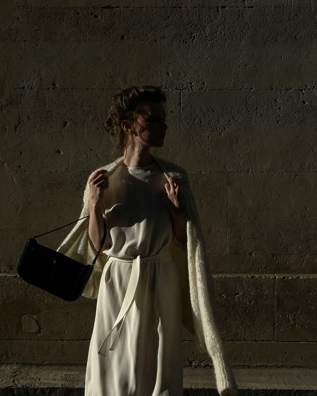
In luxury branding, design isn’t decoration — it’s psychological proof. Visual cohesion signals credibility before a single sentence is read. When every visual touchpoint aligns — typography, tone, color, and composition — your brand stops feeling like a collection of assets and starts moving like an ecosystem.
Luxury is, at its core, coherence made visible.
Why Visual Cohesion Matters More Than You Think
In a noisy digital world, consistency is what cuts through.
Clients don’t consciously think, “This brand feels cohesive, therefore I trust them.” But their subconscious does. The human brain processes imagery 60,000 times faster than text — and it’s wired to associate symmetry and consistency with reliability.
That means your brand’s design quality doesn’t just reflect taste — it reflects discipline.
As Vogue Business highlights in its exploration of design-led trust in branding, visual coherence creates emotional stability for the viewer. When your brand looks organized, the audience assumes the same about your operations.
Inconsistency, on the other hand, feels like chaos — and chaos never commands premium pricing.
The Psychology of Visual Trust
Visual cohesion triggers a primal sense of order and safety. Clients may not know why they trust a brand, but they feel it.
- Consistency = Competence. When visuals repeat patterns, the brain interprets it as reliability
- Whitespace = Confidence. Space implies you’re not trying to prove anything
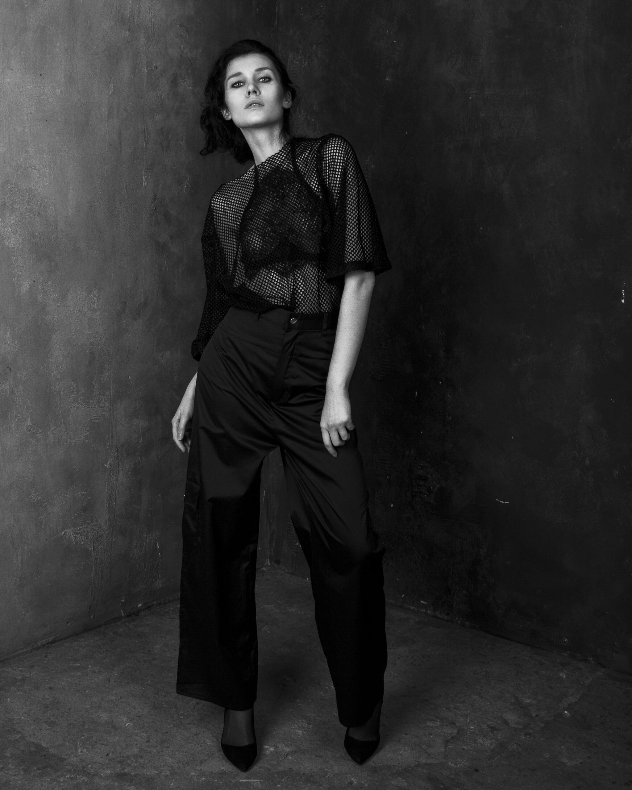
- Typography = Tone. Serif fonts feel established; sans-serifs feel modern. Both send cues about credibility and clarity
- Color Harmony = Control. Intentional use of color signals refinement, restraint, and self-awareness
Luxury design is never about adding more. It’s about removing friction until only clarity remains.
How to Build Visual Cohesion in Your Brand
1. Start with the System, Not the Surface.
Cohesion begins with structure — your grid, hierarchy, and layout rhythm. That’s why our Website Template Shop is built on editorial architecture, not random design. Each layout is pre-engineered to create harmony, consistency, and flow. Explore the Template Shop →
2. Design for Continuity, Not Campaigns.
Luxury brands don’t reinvent themselves every quarter; they refine over decades. Your brand visuals should evolve subtly, not shift dramatically. Cohesion builds equity.
3. Extend Cohesion Beyond the Screen.
Your digital brand should feel identical across every channel — website, proposals, emails, social posts, and client materials. Every visual fragment is part of the same identity system.
4. Audit Your Aesthetic Regularly.
Visual cohesion doesn’t mean stagnation. It means refinement. Periodically review your brand assets: Does your typography still align with your message? Does your color palette evoke the emotion you want clients to feel?
The Editorial Lens: Cohesion as Brand Language
Think of your brand as a publication. Every touchpoint is a page in the same issue.
Luxury design works because it feels intentional. That’s what creates credibility. Just as Architectural Digest curates design with precision and restraint, your brand’s aesthetic choices should communicate quiet confidence — never chaos, never clutter.
When visual cohesion meets narrative clarity, your audience experiences emotional alignment. They feel that you know who you are — and by extension, that you can lead them.
The Takeaway
Visual cohesion is the unsung cornerstone of luxury branding.
It’s what turns browsing into belief. When your brand feels visually unified, your audience subconsciously perceives expertise, stability, and authority. Inconsistency feels like indecision — and indecision can never be luxury.
Your design isn’t just the face of your brand — it’s the language of your leadership.


Share to: